Client
Package Design
Prompt
Develop three drink package designs. Think of them as a whole, with your choice of size and shape.
Solution
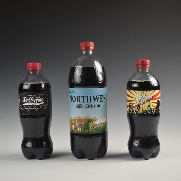
I chose the existing drink brand, Dr. Pepper, and decided that I would redesign the labels in three different styles similar to a recent campaign Dr. Pepper had done in having a “one-of-a-kind” label for a “one-of-a-kind” drink. I drew inspiration using different Dr. Pepper logos and the time periods each logo was used. I developed a drink label that incorporated their 1930’s logo, 1970’s logo and their most recent logo.
The Process
The Process
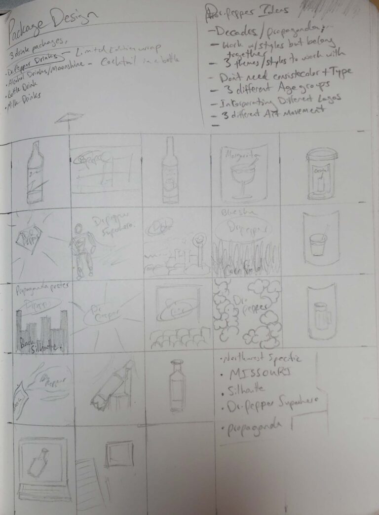
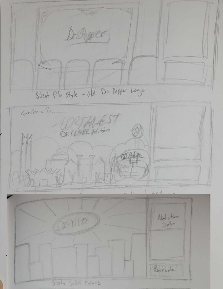
The process for creating the three different drink packaging designs using the current beverage, Dr. Pepper, began with the process of using thumbnails. I knew I wanted to create a label that incorporated the same idea that Dr. Pepper had used previously for their “one-of-a-kind” label campaign, but with my own unique labels. I concepted several different types of labels featured different styles, elements, and overall ideas. Ultimately it was decided that I wanted to use three different logos Dr. Pepper had used during their time and that drove most of the inspiration for the created pieces.
After deciding to use three different Dr. Pepper logos, I did research to see what historic events, styles or just common interests that were occurring during the time of the different Dr. Pepper Logo. Ideas began to form and I solidified my chose in choosing the 1930s logo, the 1980s logo, and their current logo. Next was concepting what elements and styles to incorporate for three different Dr. Pepper logos.
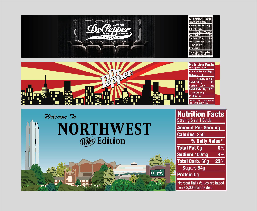
The first concept was to use the 1930s Dr. Pepper logo in the style of Noir. Since silent films were popular during the 1930s, it was natural to incorporate the 1930s logo with a silent film concept. The overall composition is a theater that is projecting a silent film that displays the Dr. Pepper logo on the screen. To push the noir style further, the same grain look that silent films tend to use when projecting was also integrated in the overall composition.
The second concept was chosen to use the 1980s Dr. Pepper logo. The logo is used as a center piece surrounded by a pinwheel background and silhouetted buildings in the foreground. The overall composition features blocky shapes and solids colors. The inspiration for this concept was drawn from propaganda posters that were used during the cold war era, that incorporates a similar blocky and solid style.
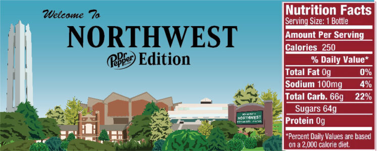
The final concept uses the current Dr. Pepper logo in a modern illustration style that incorporates my university: Northwest Missouri State University (NWMSU). The composition features a clear blue sky and several illustration trees and NWMSU landmarks that creates a compacted and layered horizon. The concept was inspired by Dr. Pepper memorabilia that has the theme “Welcome to Fansville”.
